Landing Page - what is it, its specifics and structure

A landing page is a page on which we encourage the user to take an action that our company needs: subscribe to receive an e-mail newsletter, leave your email or phone number, purchase a product, download a presentation, and so on. Such sites are aimed at a narrow audience. They are most effective in an advertising campaign when you need to focus on one thing.
If a company wants to get active leads (potential customers), one of the ways to attract them is to develop a landing page and drive traffic to it. Landing page effectiveness (LP) is measured in terms of conversions, i.e. the number of visitors who completed the desired action among the total number of those who switched to the resource.
In this article, we will tell you what a Landing Page is and why it is better than a website, what types of landing pages exist, by what logic they are created, and how to avoid common mistakes during development.
Main types of Landing Page
The following types of LP are distinguished by length:
- short — small (up to 5 screens). As a rule, it is created to collect contact information and increase the number of leads;
- long - a more common format from 5 blocks, with detailed information about the service, the benefits of the proposed solution.
For transitions:
- one-page - all data is presented in one place;
- multi-page - a rarer type, in which they first call to do something, and then redirect to another web resource.
According to the purpose of the destination, Landing Page is most often used for the following actions:
- the sale of a specific product or service;
- collection of e-mail addresses for distribution;
- announcement of the imminent release of something;
- webinar registration;
- traffic translation.
In general, a landing page is useful if you know exactly what you want to sell. For example, website development from a web studio in Kyiv for sole proprietors and small businesses.
Structure
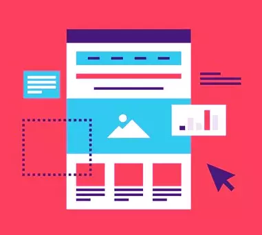
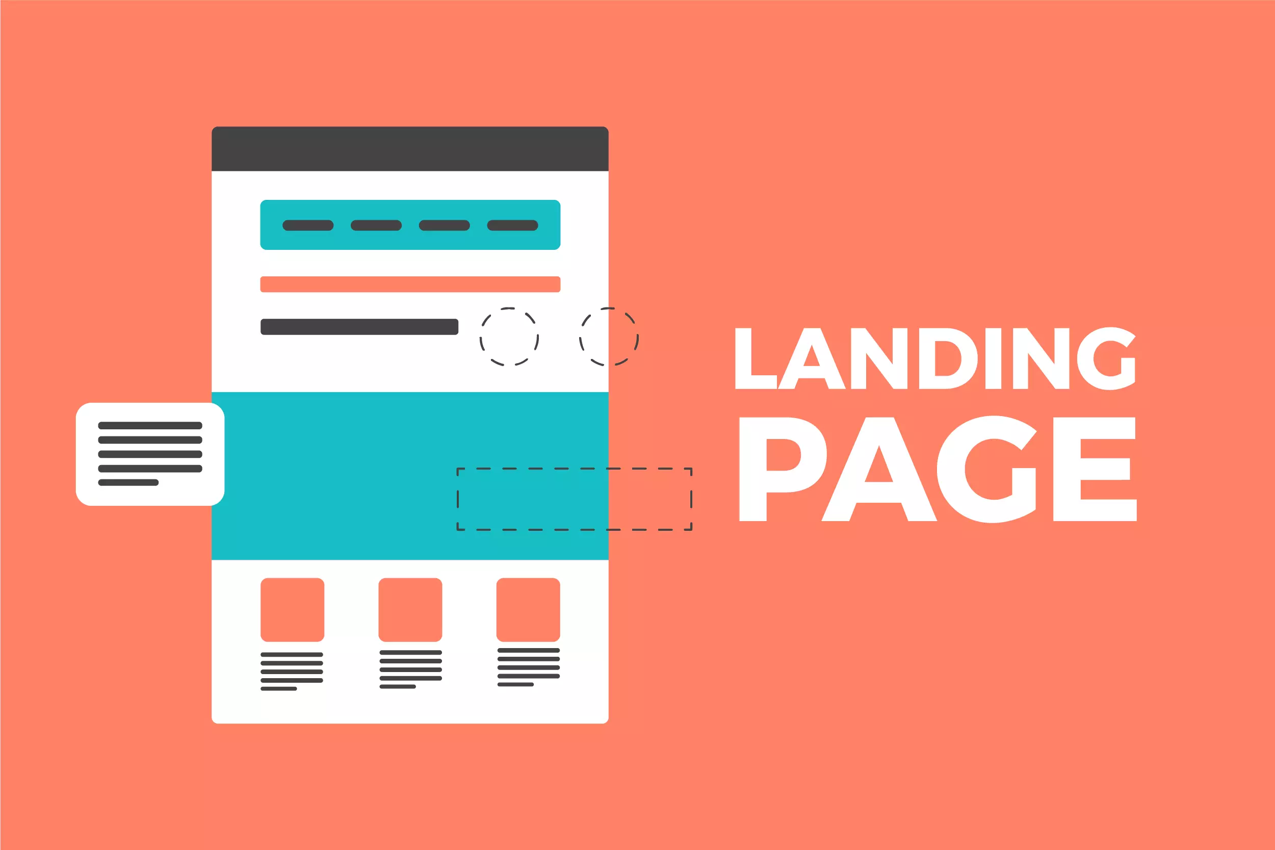
The classical structure assumes 2 parts: the first screen and all other blocks.
A landing page design is a series of successive modules on which data is located. There can be from 5-7 to 10+, depending on how much data the company wants to host.
 The task of the first part is to interest the user, make him read the title, evoke emotions, make it clear what they want from him. The rest can be used to confirm the benefits with facts, close objections, prove your expertise, and testimonials from satisfied customers.
As a rule, when building a framework, “selling formulas” are used - they do not give a 100% guarantee of results, but they allow you to create a basic scenario for passing leads.
The two most commonly used formulas are:
- AIDA - tied to attract attention, interest, arouse desire + call to action.
- PMPHS is about identifying and exacerbating the problem, showing hope, offering a solution.
What you need for a good job
For a Landing Page to work, it definitely needs traffic and a button. Without a flow of people, it is useless - your offer will not be seen by the people for whom you are creating the offer. The button leads the user to perform the necessary action, which he is unlikely to do without it.
How is a landing page different from a website?
In short, the landing page contains only one page and is tailored for a specific purpose. A web resource can have multiple goals and multiple pages.
Typically, a Landing Page is a long page with blocks that contain photos, infographics, reviews, benefits, and other elements. There is no breakdown of information into internal sections of the web resource.
Common Development Mistakes
When creating an LP, inexperienced marketers often make common mistakes. We've put together a list so you can avoid them:
More doesn't mean better. If you could fit all the information on 5-6 screens, that's good. Do not artificially stretch the LP.
The so-called "tasty text" will not help. There is no “magic formula” that will instantly increase conversions by 200% and increase leads to your sales team.
The offer must be clear and understandable. Vague offers about “inexpensive prices”, “fast deadlines” are an incomprehensible offer without exact numbers. Give facts.
- You don't have to sell multiple items at once. The person will get confused and quickly "cool down".
- Chaotic structure. Modules must be placed in a specific sequence to be effective.
- Landing Page development is a separate part of Internet marketing, which has its own clear rules and tools. By carefully studying them, you will be able to prepare a quality LP that will lead potential customers to your sales team.
And if you are not confident in your own abilities, please contact us. We will help you create a website, landing page and sell a specific product or service.
Your project
Call/write:


